
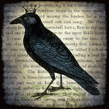
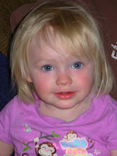
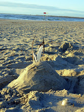
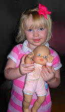
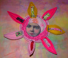
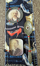
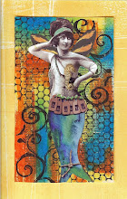
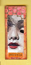
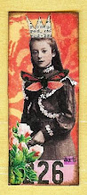
 My original photograph.[number stamp by Robin Marie Smith]
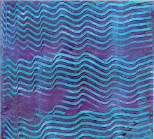
The past week or so I ran across a pad of very old 120 lb. watercolor paper. Hmmm. What to do? what to do? I decided to pick two colors of paint, a glaze and give myself black and white for highlights. I picked Golden's Titan Buff, Raw Sienna, and Golden's Aquamarine Glaze. These are colors I rarely use.
I tore out all the sheets and began applying paint randomly. I grabbed a plastic bag and blotted paint with that to give it shading and depth. Before the paint dried I applied glaze with the plastic bag. Then, I added another layer with dictionary pages torn randomly and applied to the paper. More paint was added to cover the dictionary pages, pounced again with the plastic bag, added glaze, then I let all the pages dry. Then I picked some random stamps and stamped in black along areas I felt would benefit.
After everything had dried I went back and added circles, more paint, and more glaze. I then grabbed my handy studio toothbrush and splattered some of the pages with black paint. When all of this had dried I cut down the sheets from 9" by 12" to 8.5"by 11" so that they would fit through my printer.
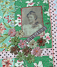
The images to select was a much harder process. I was not sure how well the ink would sit on the painted paper or if I would get the "look" I saw in my head. I selected images from my own photographs, a couple of digital collages I had made, and some Library of Congress images that speak to me.
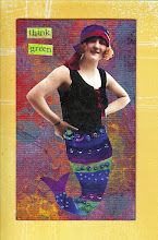
Once the images were printed and I was satisfied with them. I took my Derwent Inktense pencils and added some highlights to certain areas. You have to be careful when you use your water brush, as you do not want to disturb the ink from your printed image. If you are going to highlight a lot of areas then do this before you print your image. After all had dried I went back and added some stitches in a blue thread with my sewing machine, again sticking to the palette I had chosen.
This was so much fun and a real learning process for me. It has inspired and given me several other ideas as I went through the process. I love the way the paint highlights and sets the mood for the images. So, this is what I did on part of my summer vacation...


21 comments:
Holy cow and a BIG WOW!!! This is stunning work, Elizabeth!!! The textures and layers are luscious!!!! To be honest, I've never given thought to running a painted page through the printer. Your results are amazing and full of inspiration. Hugs, Terri xoxo
WOW! wonderful 'patina' created with those paints...thanks for sharing your process.
that is fabulous! i love the color. i can see myself sitting in that chair, drinking coffee, and thinking about what the day might bring. awesome job.
blessings,
aimee
Hi Elizabeth,
I agree on Terri with this -
WOW, thanks for sharing.
Hugs,
Marie
These are all GORGEOUS!!!
TFS ~
Thank you so much for being so generous and sharing your technique with us. I appreciate that so much. It's one of the things I love about my blogging buddies. And, of course, I LOVE what you did. I like the fact that you picked colors that you normally don't work with either. And, look how wonderful it all turned out!! :)Bea
THank you for sharing this process Elizabeth!!! simply awesome! I've always wanted to run through a painted page (on watercolor paper) through the printer. Is there a specific printer/settings which you used for this process?
Cheers
Steph
Absolutely stunning art, Elizabeth! The color palette accents the piece very nicely, and I love what you've done with it here...and in the previous post, as well. Thank you for sharing the process with us. Great art!
Wonderful work! Your colors are perfect!
Elizabeth these pages and pieces are stunning. What a cool find (the paper ;) and a great treatment!! BTW do you know that Krylon makes a product, Workable Fixatif, that you can use on you r printed page and really helps make it un-moveable (there, I made up the word I needed ;). This stuff works great, I use it frequently in all sorts of pieces. I got mine at Michael's too, so it isn't expensive!
Your photos are stunning ~ I'm playing with my camera more and teaching myself Photoshop. So cool!
xo,
Gaye
Wow, these examples of how to use one of the background sheets are wonderful. Love them all but the chair is my favourite.
WOW! these are fabulous Elizabeth! Never heard of Golden glazes but now I need to get me some. Beautiful!
All of these are great Elizabeth!
Cheryl
Wow, this entire series is positively stunning!! Thanks so much for sharing some of the process - what gorgeous pieces of art!
Wow! Even though I think I understand your technique I don't think I could come close to your beautiful results. I'll have to give it a try. Fantastic!
Oh my, these pieces are just fabulous. I think this one with the chair is my favorite. Your are very generous in sharing your process with us.
Also thank you so much for the lovely comments on my ROD journal.
Wonderful! So cool that you challenged yourself like that.
Incredible....
Elizabeth I had to read this twice to understand that you actually put the paper through your printer! I was going to ask if you had used a transfer process until I saw other peoples' comments. Ok, I'm going to have to try it. You are always an inspiration, I must say.
This came out great! My printer won't feed anything like this through it. I've tried but it jams every time. You've done a wonderful job of creating a full-of-depth picture.
Amazing! I love what you did using so few colors. I've never tried that before but now you've made me want to go grab 2 colors and see what I can do.
Thanks so much for posting this. Your work is fantastic!
Post a Comment